When finger-lickin’ flavours meet vibrant lighting technology
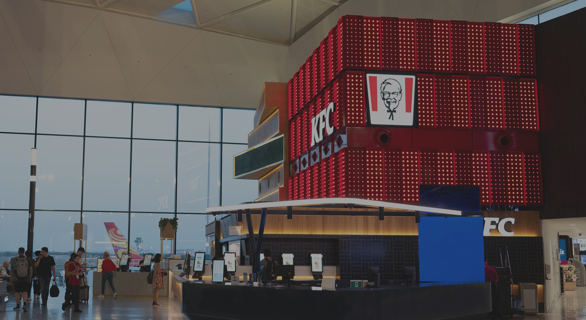
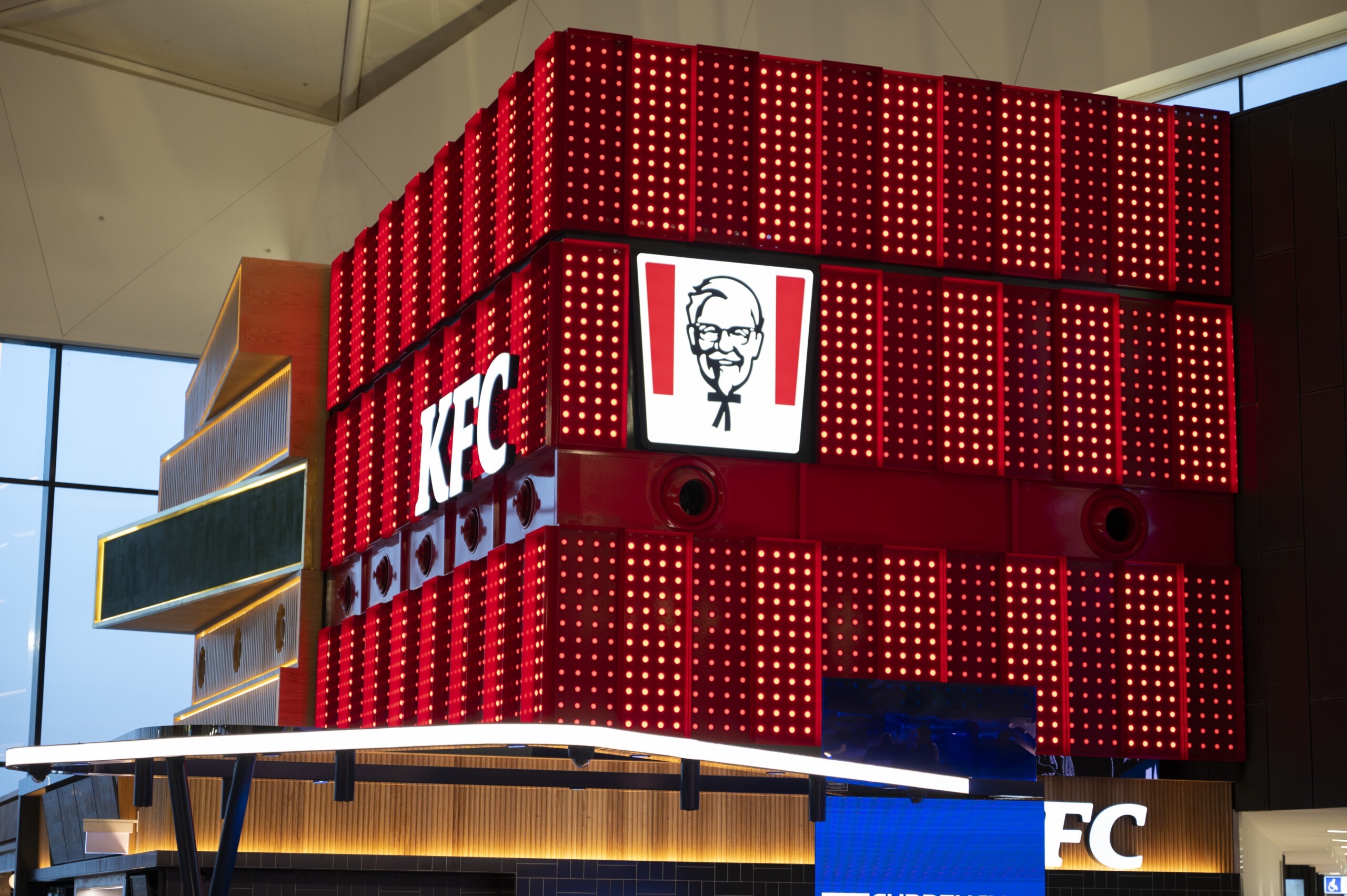
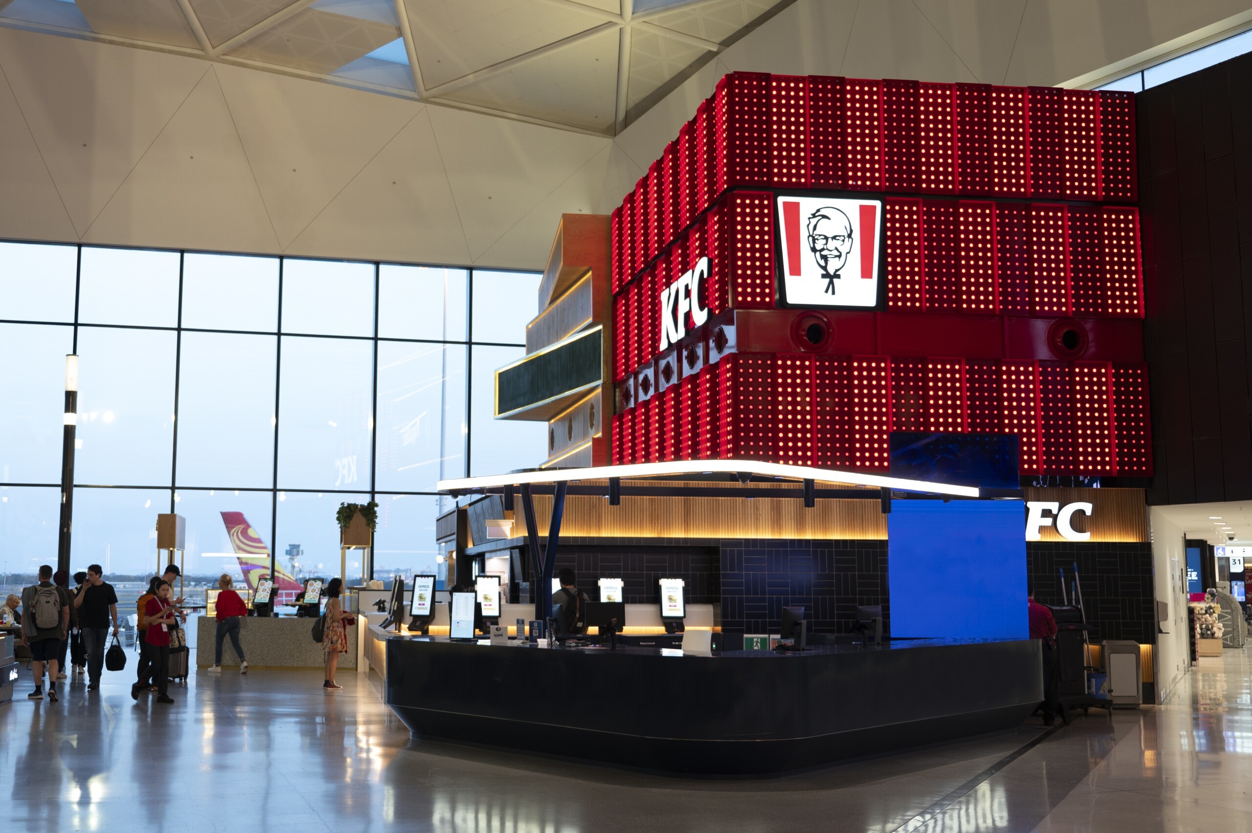
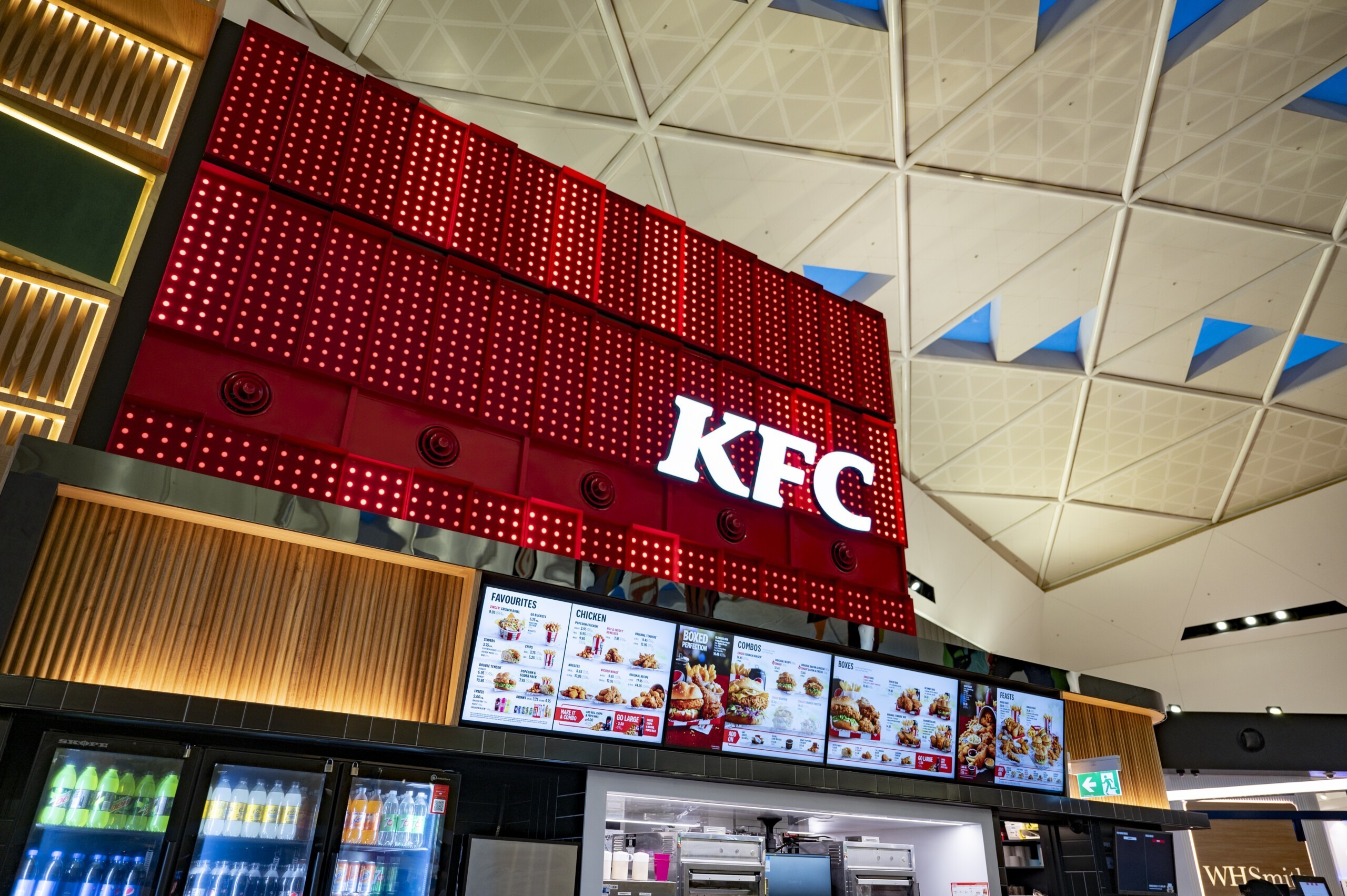
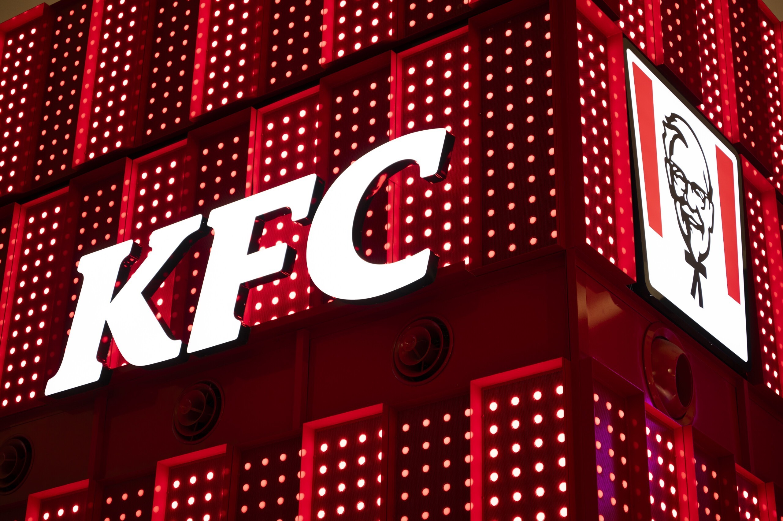
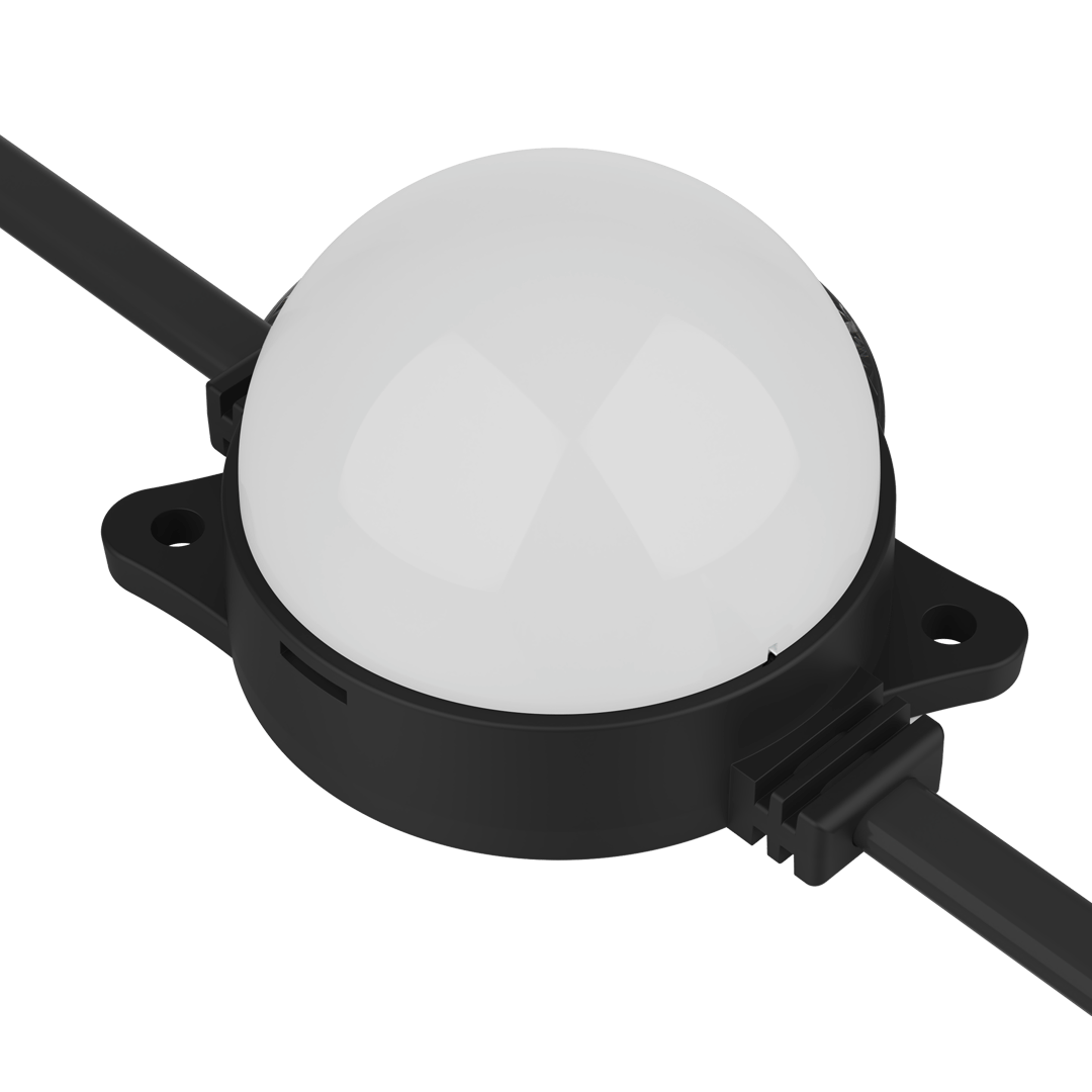
ENTTEC were enlisted to help create a lighting installation to differentiate a new KFC outlet from the surrounding food stores at Sydney International Airport. The result needed to be dynamic and eye-catching, without being gaudy or over-the-top. Being in a public space, the effects could not be too fast or flashy, and strict branding requirements meant using specific colours only. High-resolution SMART PXL40 LED pixel dots with their optical-grade polycarbonate lenses were integral to the success of this project, ensuring that there was no colour-shift in the lighting, with reds at no stage shifting into pinks or purples.
| Client | Propmill |
| Type | Hospitality, Architecture |
| Location | KFC Outlet, Sydney T1 International Airport, Sydney, Australia |
| PRODUCTS | ELM (ENTTEC LED Mapping Software), OCTO, Smart PXL LED Dots |
| Year | 2023 |
| project credits | Installer: Odyssey Construction & Fitout Programming & Commissioning: ENTTEC Experiential Design Collaboration: Propmill MEP & Lighting Design: Cundall Project designer name: VECA Group |
From its humble beginnings as a roadside café in 1930s smalltown Kentucky, growing to more than 25,000 locations in over 145 countries around the world today, the distinctive red and white iconography of KFC has become firmly and often endearingly planted in the minds of millions around the world. But when their biggest rival, McDonald’s, created a stir at Sydney Airport’s International Terminal 1 recently, KFC’s parent company Yum! Brands couldn’t exactly sit around and do nothing. They had a big job ahead of them though, thanks to a genius benchmark set by renowned Sydney design consultants Landini Associates. They constructed a ‘sky kitchen’ for McDonald’s – a second level floating above their counter taking the form of a giant yellow glass box containing their kitchen. Food court visitors could then watch the upstairs staff inside the box preparing meals and sending them down a mesmerizingly fun conveyor system to the hungry customers below.
The result is a visual and sensory experience that’s more Willy Wonka than high street takeaway, and of course everybody who sees it loves the spectacle, especially on social media.
So where did this leave the neighbouring KFC store?
Run by experienced operator Airport Retail Enterprises and overseen by the head office at Yum! Brands, it was clear that this particular KFC location needed something to not only help them stand out in spite of the new McElephant in the room, but also differentiate themselves from all of the surrounding food outlets. Something dynamic, eye-catching, and on-brand, without being gaudy or over-the-top.
Enter Brisbane-based experiential consultancy PropMill, with more than a decade of experience in the design and production of compelling experiences in the built environment, both physical and digital.
PropMill were keen to incorporate ENTTEC’s Smart PXL dot direct-view LED fixtures because they look visually stunning, are easy to arrange into complex configurations, and are also individually-programmable.
The concept was fleshed out and system designs were tested, but the project didn’t end up going ahead, unsurprisingly, given the arrival of a global pandemic.
Fast-forward a few years, and PropMill began talking to ENTTEC about a façade design for a specific restaurant, which turned out to be the KFC outlet at Sydney Airport’s international terminal which happened to be opposite the newly-opened, attention-grabbing McDonalds sky kitchen.
Being in a public space, any lighting effects employed couldn’t be too fast or flashy, plus KFC’s branding requirements would mean sticking to specific colours only.
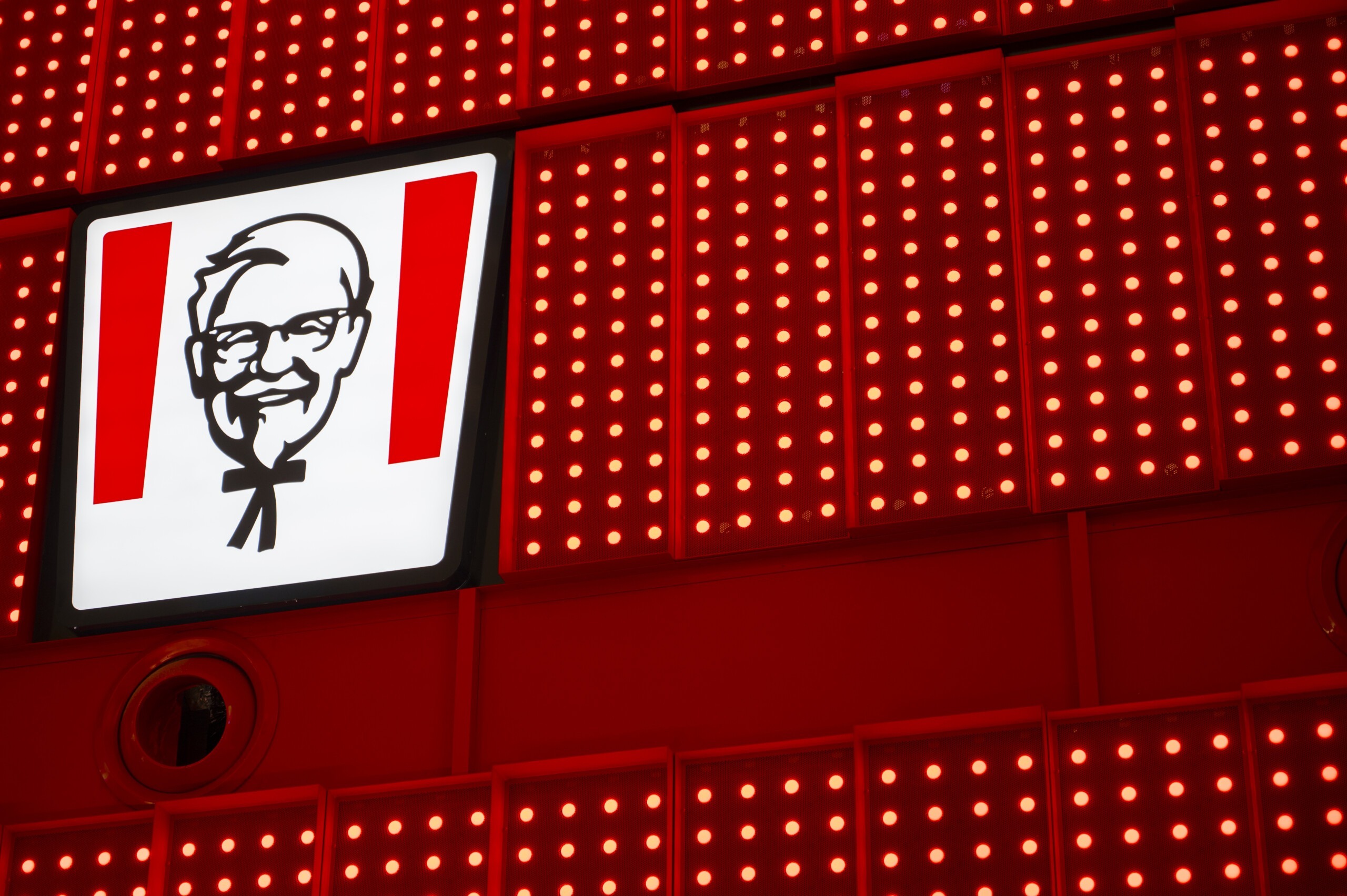
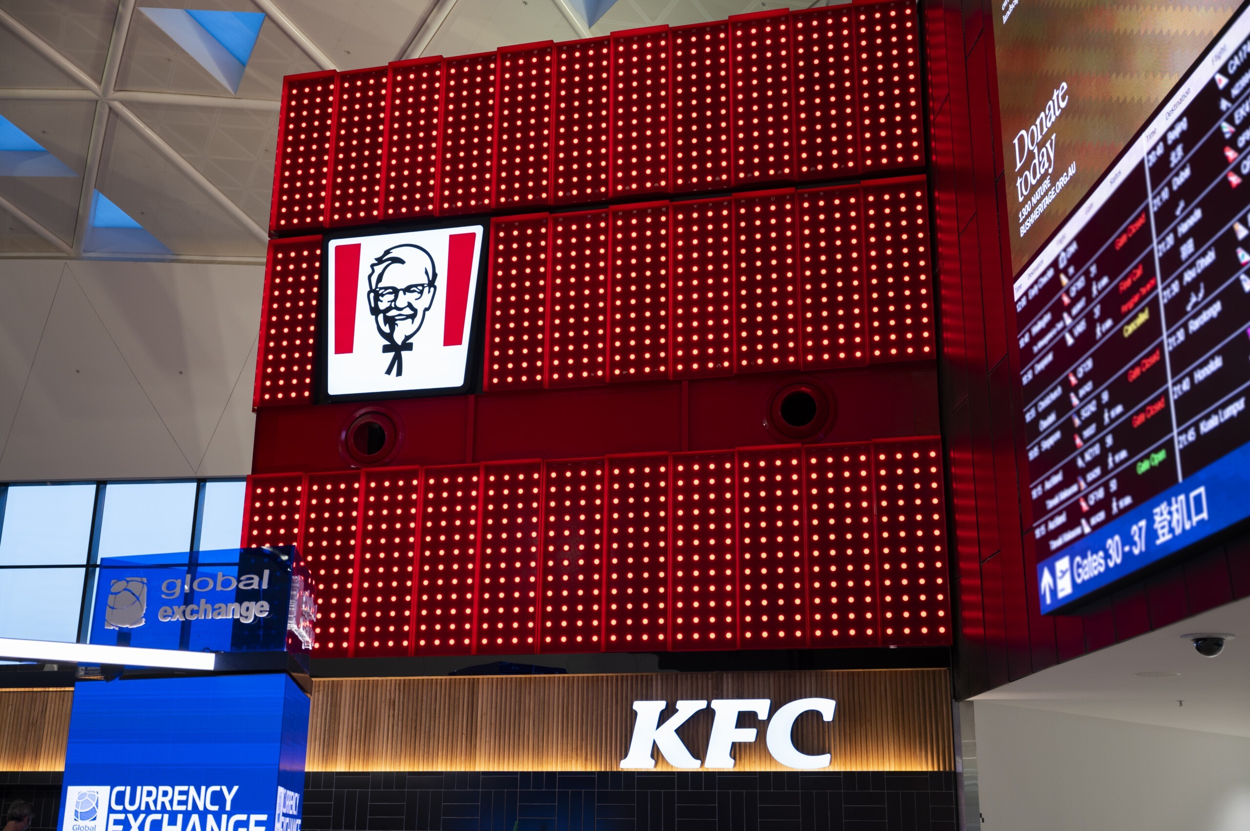
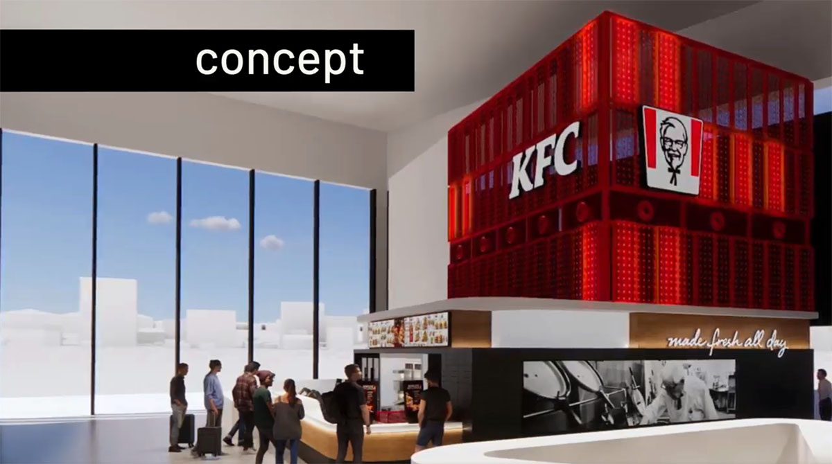
The concept was both logical and simple in essence: a giant, flashing red and white box that instantly makes people think of KFC.
Solution
Lights.
Lit up by Smart PXL 40 Metal Dots
Design-wise, this was very straightforward from ENTTEC’s point of view, because it was all rectangular grids which lend themselves perfectly to pixel mapping. And once again, with their rich colour output and ability to form a great architectural feature in their own right, Smart PXL dots seemed the obvious choice of LED fixture.
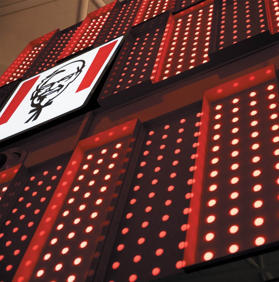
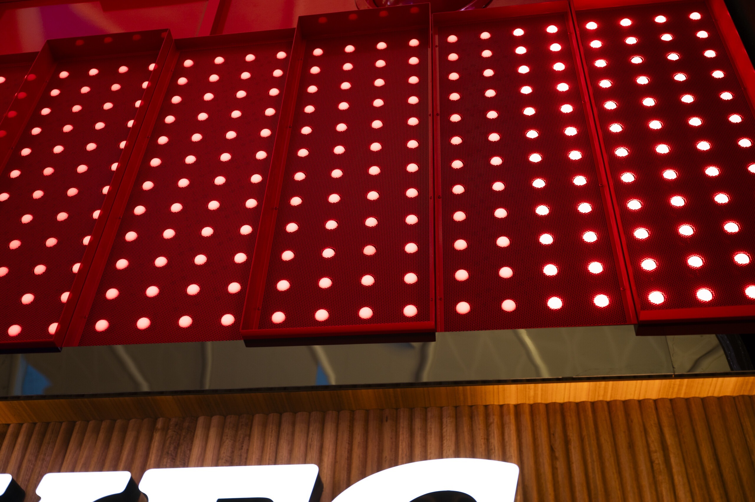
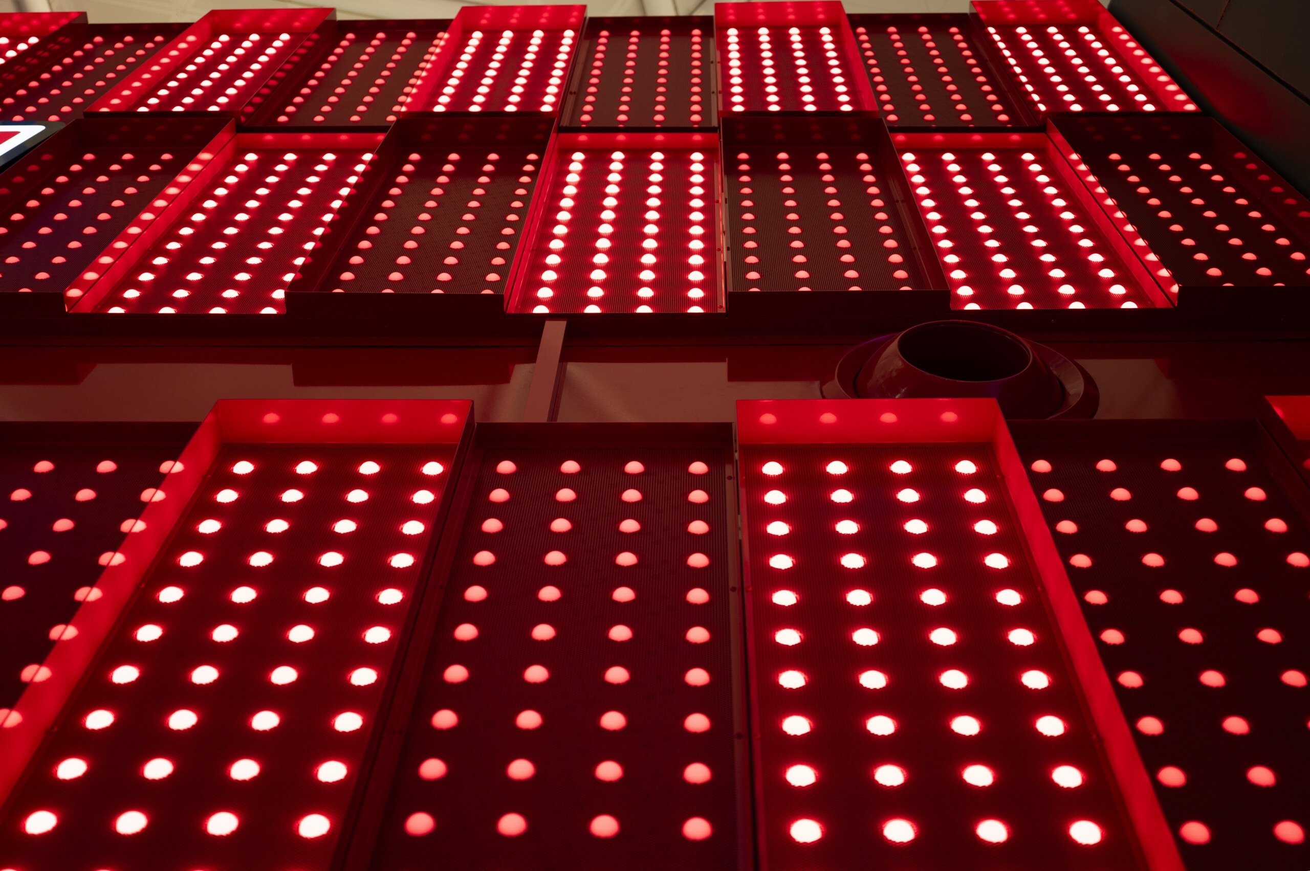
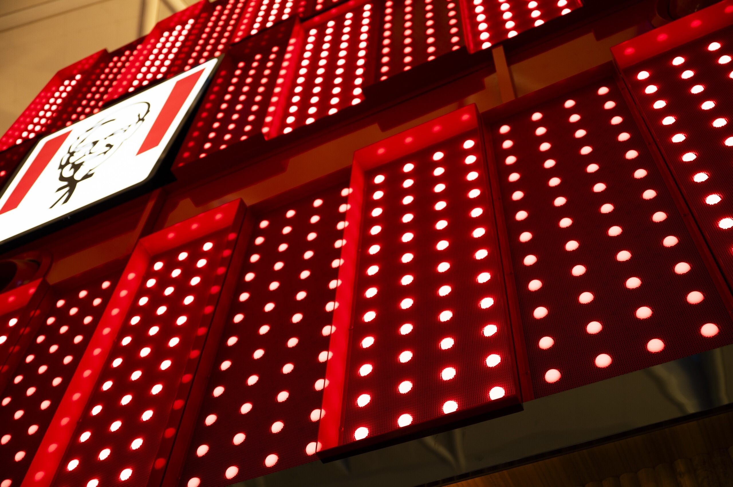
Choosing aluminium PXL40 dots with ⌀41.5mm diffused polycarbonate domes and 125mm spacing fit the scale of the rectangular grids perfectly. To make up the visible two sides of this gigantic ‘KFC box’, 75 rectangular panels each containing a 4 x 12 array of pixel dots meant that 3600 dots in total would be required. ENTTEC’s customer service consultants were able to calculate and draw the design, using a simple repeating unit that could be multiplied to make the layout more straightforward to configure and operate.
ENTTEC’s team then engaged with the interior designers on the project, VECA Group, to do some budgeting for how much it would cost, and to discuss the kinds of shows that would be programmed. Being a branded application, VECA were naturally very concerned about colours being very specific. It had to be red and white only. No pink. No other colours.
ENTTEC consultant VJ Suriya takes up the story:
“Because Smart PXL dot diffusers are made from optical-grade materials, there is no colour shift at all, so achieving the crisp red and white they desired wouldn’t be a problem.
We sent them a pre-programmed DIN Pixie with red and white show samples, but from the accompanying small string of demonstration dots they weren’t convinced that it was going to come across quite how they wanted it to.
So, that’s when I connected up massive runs of dots in our factory, ran patterns on ELM, turned out the lights to stop the flickering and then did some recording. I was able to get it to the point where it looked great, and you could see the movement on it nicely.
This time they were impressed and wanted to see more, so I set up the specific colour band patterns with the correct and took some good quality video of that. And they loved it. We also gave them all the compliance certificates and information that showed how the product adheres to international standards regarding resin encapsulation and fire safety. After that, I imagine their only real concern was whether such an eye-catching shop might inadvertently distract pilots!”
Sydney-based contractor Odyssey Construction & Fitout won the project and ENTTEC began to hear from their engineers who were employed to provide the installation. The team at Odyssey were really engaged with the technology and interested as to how things work.
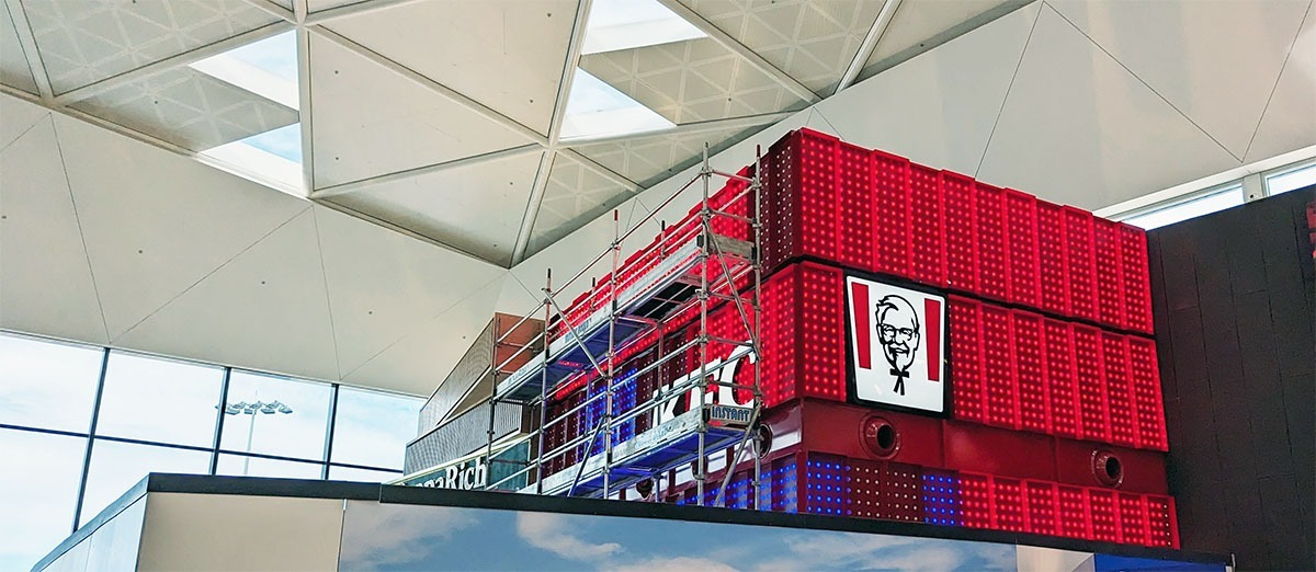

Because ENTTEC Smart PXL dots are not only designed but fully manufactured by ENTTEC in Australia, the team in our Keysborough factory were able to complete the order ahead of schedule before sending our support and testing engineer Matt up to Sydney airport to ensure everything was installed and set up correctly. Matt used ELM (ENTTEC LED Mapper) to create the shows in keeping with the brief, so that the overall effect was eye-catching but not too “out there”.
Most importantly, the functionality of the testing and mapping tools within ELM were essential in enabling the installation to be quickly programmed within the short timeline set by the busy nature of an international airport.
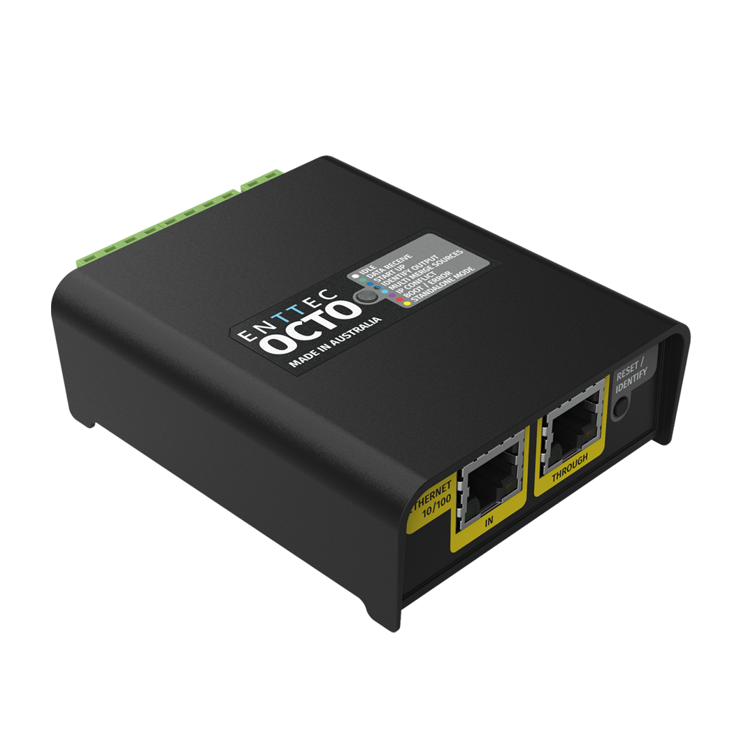
A series of different show options were then recorded from ELM onto an ENTTEC S-PLAY show controller, with which the client could select their desired static or moving lighting state with ease. The S-PLAY could then output its DMX show data into an ENTTEC OCTO pixel controller which converts the information into the LED pixel protocol required to operate the LED dots.
Each stage of the entire process, from the mapping software to the lighting controllers and then the LED fixtures themselves, involves an ENTTEC designed and manufactured product.
Gabi Wilmers from client Airport Retail Enterprises told us: “The dynamic façade of KFC Sydney T1 International Terminal offered an enormous opportunity to create a one-off visual experience.
ENTTEC – in particular the customer service team led by VJ Suriya – was instrumental in achieving our goals. VJ has the ability to explain extremely technical processes and make the seemingly impossible feel possible. Proactive and positive, ENTTEC had a genuine desire to keep pushing the project forward and achieve an end result that all involved can be proud of. The final installation has exceeded all expectations, and we look forward to working again with ENTTEC in the future.”
VJ concludes, “I think was a very good project overall because it was an end-to-end installation. It involved a long process and there were challenges along the way, but the team in Keysborough were brilliant and the result was that it looked fantastic and continues to look amazing day in, day out. It truly does grab your attention, even with McDonalds nearby. The whole team at ENTTEC are very proud and happy with how that project turned out.”
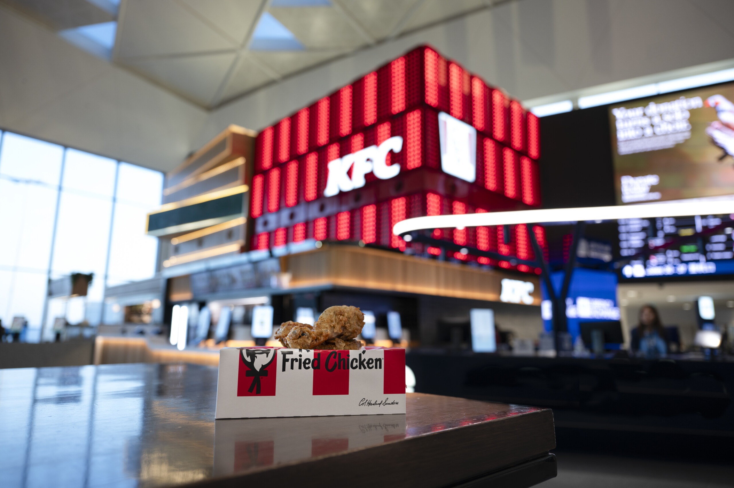
The impact of the new KFC outlet wasn’t lost on visitors to Sydney Airport either. Commenters online were quick to observe that you can see the impressive red and white KFC display inside the dining area from the tarmac on the runway itself (for reference, it’s right above international gate 31!). Though it’s fair to say that the main reason for travellers to get excited is more likely the prospect of getting to nibble on a box of Wicked Wings before embarking on their long haul flights.
